Prometheus Usage Charts–Or Who Has The Most Metrics
Once developers have experienced the benefits of metrics instrumentation they go nuts and emit metrics for everything. That is a generally a good thing, but could also lead to unnecessary load on Prometheus or, depending on the label usage, extended query evaluation times. Sometimes it helps to see it to believe it. We recently added a usage graph for the metrics space to give our customers insight into their timeseries’ label space.
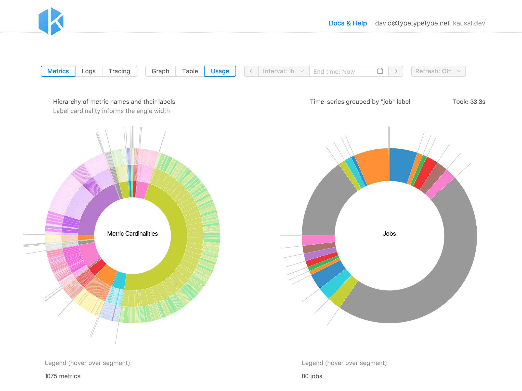
Cardinalities Explored
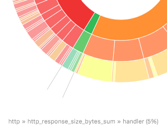
Every unique key-value combination of a metric’s label set creates a new timeseries. Each of those timeseries has its own storage needs. It is therefor advisable to keep an eye on the label space, e.g., labels with IDs, IP addresses, etc. This is part of Prometheus best practice for applying labels.
But how can we easily find those offenders? Inspired by disk usage charts we created a cardinalities chart. For all metrics, we are retrieving the label space and then count the values for each label key. Those counts then inform the angle width of the segment in the chart’s outer ring. For convenience the segments are grouped by metric name (middle ring) and metric name prefix (inner ring).
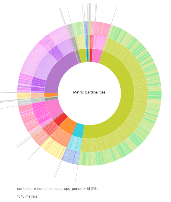
If all metric labels have low cardinalities the outer segments should have similar widths. But if one label key has a lot of values (relative to all label keys) then its segment is proportionately bigger and easy to spot.
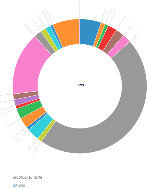
Which Jobs Are Producing The Most Timeseries
There are certain labels that share a semantic across organisations. “job” is such a label–it represents a process that may be replicated across instances (see Prometheus concepts). As such it is a good candidate to group timeseries by if a user wanted to see which processes are instrumented at all, and which in comparison emit more metrics data than others.
The distribution is simply determined by going over all timeseries (each being a set of labels) and incrementing a counter that pertains to the timeseries’ job label value. If a timeseries has no job label, it is counted as “Others”.
Try It Yourself
We made the Prometheus usage chart generators open source.
Here is the link to our repository for our Open Source projects (yes, we’re going all-in on mono-repos).
In that repo, the usage charts are part of what will become a Prometheus Visual Toolkit, with more helpers that give you insight into your Prometheus.
The usage charts work for a vanilla Prometheus installation (running on http://localhost:9090/).
If you need a different URL, just patch the api proxy in package.json.
Give it a try, and contributions are welcome!