How To Get The Most Out Of Prometheus Histograms
When using service level metrics, as suggested in the RED method, histograms play a central role. But even for a narrow time interval it is impractical to impossible to look at all latencies. Instead we can look at their distribution.
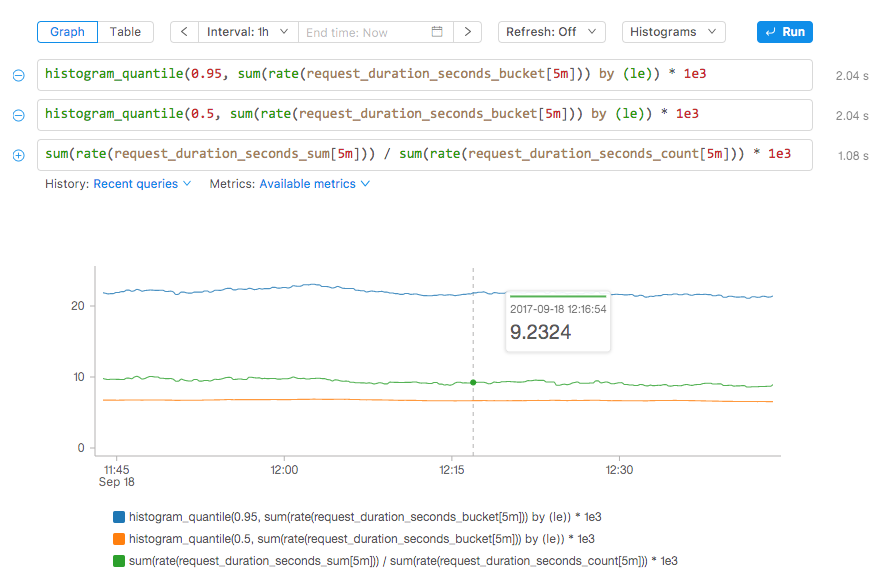
A distribution becomes easier to reason about if it is ordered and partitioned into percentiles. Some percentiles are of particular interest. Looking at the 95th percentile gives you confidence in saying 95% of requests completed in a certain number of seconds. This is often specified in service level agreements (SLAs). In this context you are aligning your monitoring with business objectives: It no longer pays off to invest extra engineering effort in order to service all (100th percentile) within a certain number of seconds. Making this tradeoff allows you to move faster in your business.
Another useful percentile is the 50th, which is the median of a distribution, meaning half of all requests were answered within a given time, say 100ms. Comparing the median with the mean (all request latencies summed up, divided by the number of requests) gives you an idea of where the bulk of the distribution is located. Looking at the mean also helps you confirm that the bucket sizes you picked for your Prometheus histogram are wildly off. The mean is guaranteed to be correct it is a simple division of two counters. But if that mean value is bigger than your 95th percentile, then the buckets in your client library might be misconfigured.
Now how do we chart all three in Prometheus? They are independent queries so we need a way to specify those. At Kausal we decided to allow multiple input fields for a single chart so that you can combine queries and see them graphed on the same canvas. The queries are run concurrently, taking advantage of Kausal’s scalable version of Prometheus called Cortex. When they return in the browser they are combined and plotted in the same graph.
Writing histogram queries in PromQL is difficult.
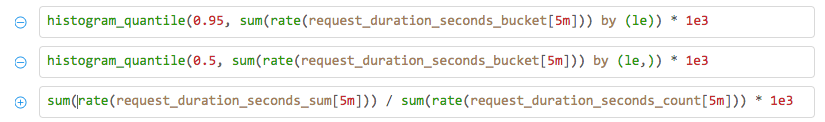
First you need to remember to aggregate the buckets by the le dimension, something of an internal abstraction in the way histograms and percentiles are implemented in Prometheus itself.
A common mistake is to forget to rate() the buckets, and instead calculate the all-time 95th percentile latency, and not the moving-5-minutes latency, for instance.
Lastly, you have to remember to sum() and rate() the metric in the correct order, otherwise the counter overflows will not be handled correctly.
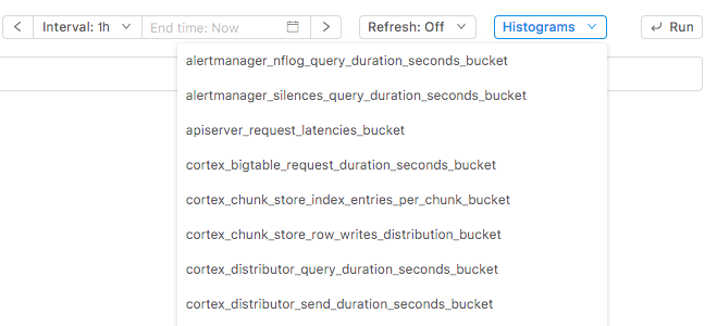
So we decided to add a helper dropdown that lists all metrics that support histograms:
By selecting a metric from the dropdown Kausal automatically creates three query fields and creates useful queries: the 95th percentile, the median, and the mean. With one click you can see them all in one graph.
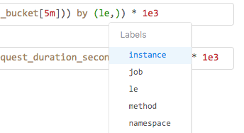
You can treat these as a starting point and modify the queries with selectors according to your needs, e.g., {job="api-server"} or adding aggregation by a particular dimension, e.g., ...by (job, le).